Water Equity
UI/UX / Visual Design / Product Design
WaterEquity is an impact investment opportunity that aims to expand access to clean water and sanitation by creating and managing funds that invest in a portfolio of financial institutions and enterprises in emerging markets.
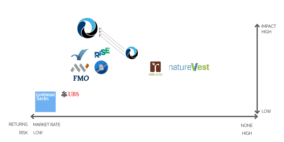
WaterEquity needed help distilling its core message in a way that was clear and compelling for potential investors and funds. As the category of impact investing was beginning to rapidly expand, it was more important than ever to determine and illustrate what made WaterEquity a unique investment opportunity.
goals
- Improve clarity of offer through carefully crafted messaging.
- Differntiate brand from other impact investing funds both in message and visual style.
- Create a brand style that balances a credible financial feel with the social gains of impact investing.
market insight
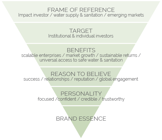
This project began with extensive research that included market analysis, target audience investigation, and a thorough review of internal expertise. At the end of the initial research, clear differentiators became an outline for key messaging and content development that brought WaterEquity’s story to life.


brand development
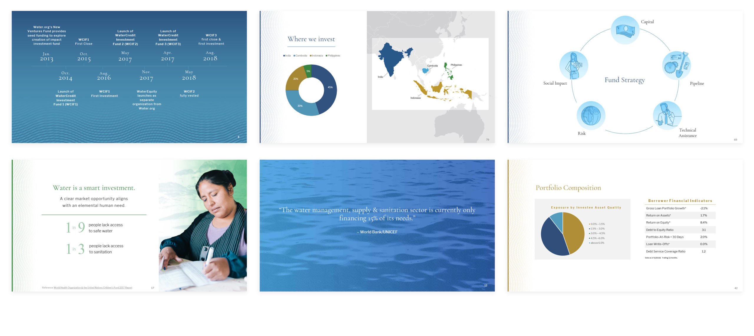
A visual look that balanced the financial and social benefits of impact investing was developed. The look incorporated etching styled elements, strong layout structures with ample white space, and classic typography styles to lend a financial feel and support the clarity and vision of WaterEquity. Social impact was highlighted with imagery of real people who benefit from WaterEquity’s efforts.
UI/UX + Visual Design
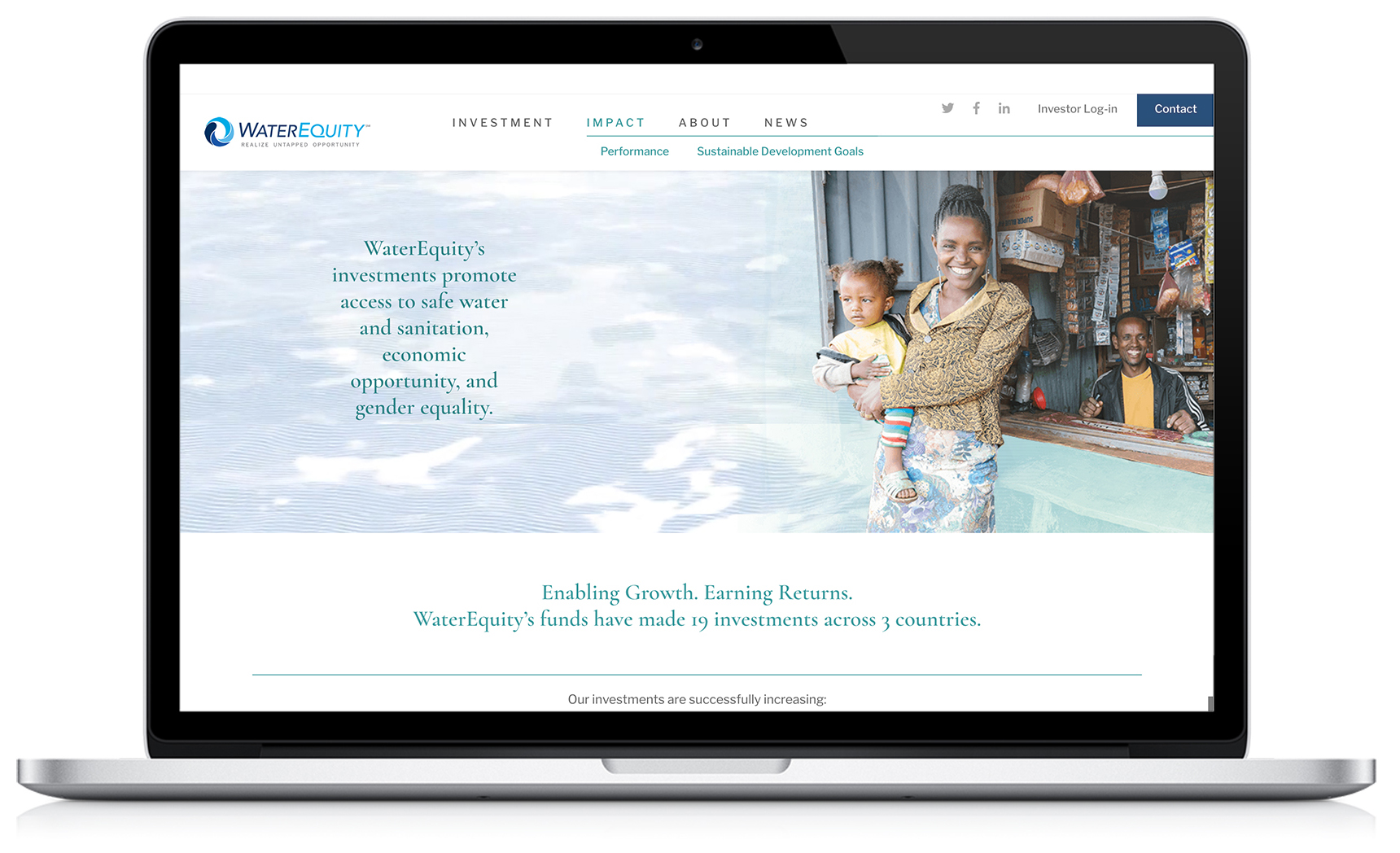
With clear and compelling messaging crafted and a strong brand direction established, the website’s information architecture was created with a focus on ensuring key points were offered at a high level. Topics were organized under categories to provide a clear structure and improve the ability to quickly drill down to relevant content.
Color coding kept information organized. Whitespace worked to keep information manageable and added a feeling of clarity and crispness.
The engraving brand element came to life with 3D animation, brining movement to the page.
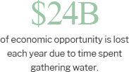
Key data points were styled as pull-text to improve credibility by letting data and evidence lead the narrative.
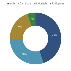
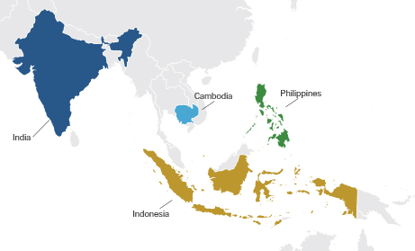
Charts and graphs improve the impact of data with a quick read, working on the web and also in investor pitch decks and quarterly and annual reports.
