my fitnesspal
UI/UX / Visual Design / Product Design
My FitnessPal is an app dedicated to helping users achieve and maintain a healthy weight and balanced nutrition. The app allows users to log food and exercise items daily, enabling them to see how close they are to their targets for the day and also track progress towards long-term goals over time.
Over its evolution, the app had many features added. To grow product awareness features were added to encourage social sharing. To boost business goals, third party content marketing was added. The growth of features left the app feeling overwhelming. Prioritization and lack of positioning around content created conflict with business goals competing with user priorities.
goals
- Improve the user experience by making the most important info easily accessible at a glance.
- Reorganize features to align with key user goals, improving visibility and encouraging engagement.
- Balance business goals with user needs by improving integration, repositioning as valuable content, and adding personalization to improve user engagement and conversion.

STRUCTURAL & DESIGN UPDATES
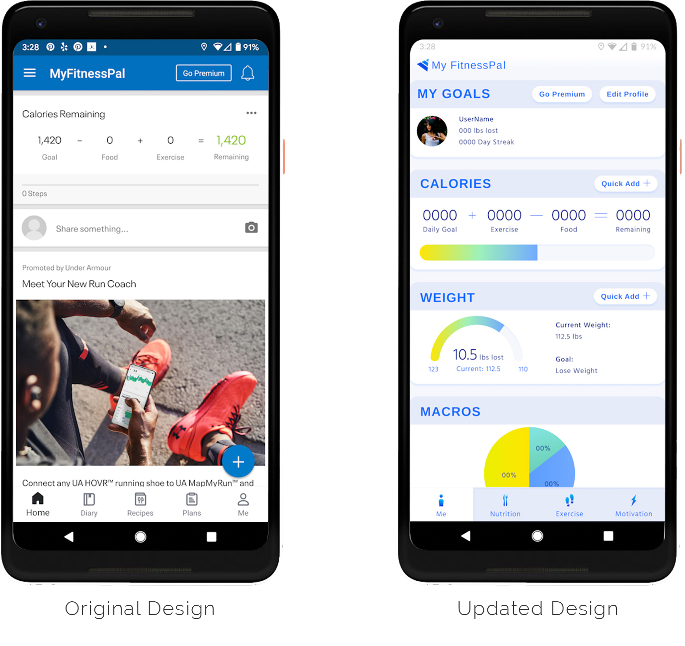
The existing design and structure of the My FitnessPal app felt overwhelming.
Structural updates re-organize the key app features by four primary user goals and use tile modules to bring important user content to a higher level of visibility.
The home screen now features user specific content that provides a clear overview of the main components of his/her goals in a tile design structure. Tiles feature “quick add” buttons to easily add diary data and “view more” links to delve deeper into a specific section.
Design changes to the coloring and visual style freshen up the experience and bring visual hierarchy to the information while also adding an optimistic feel to keep users motivated. The use of gradients in charts help to visually illustrate progress and movement.
View the Figma prototype of the updated “Me” section to see the change in action.

SOCIAL AND PROMOTIONAL UPDATES
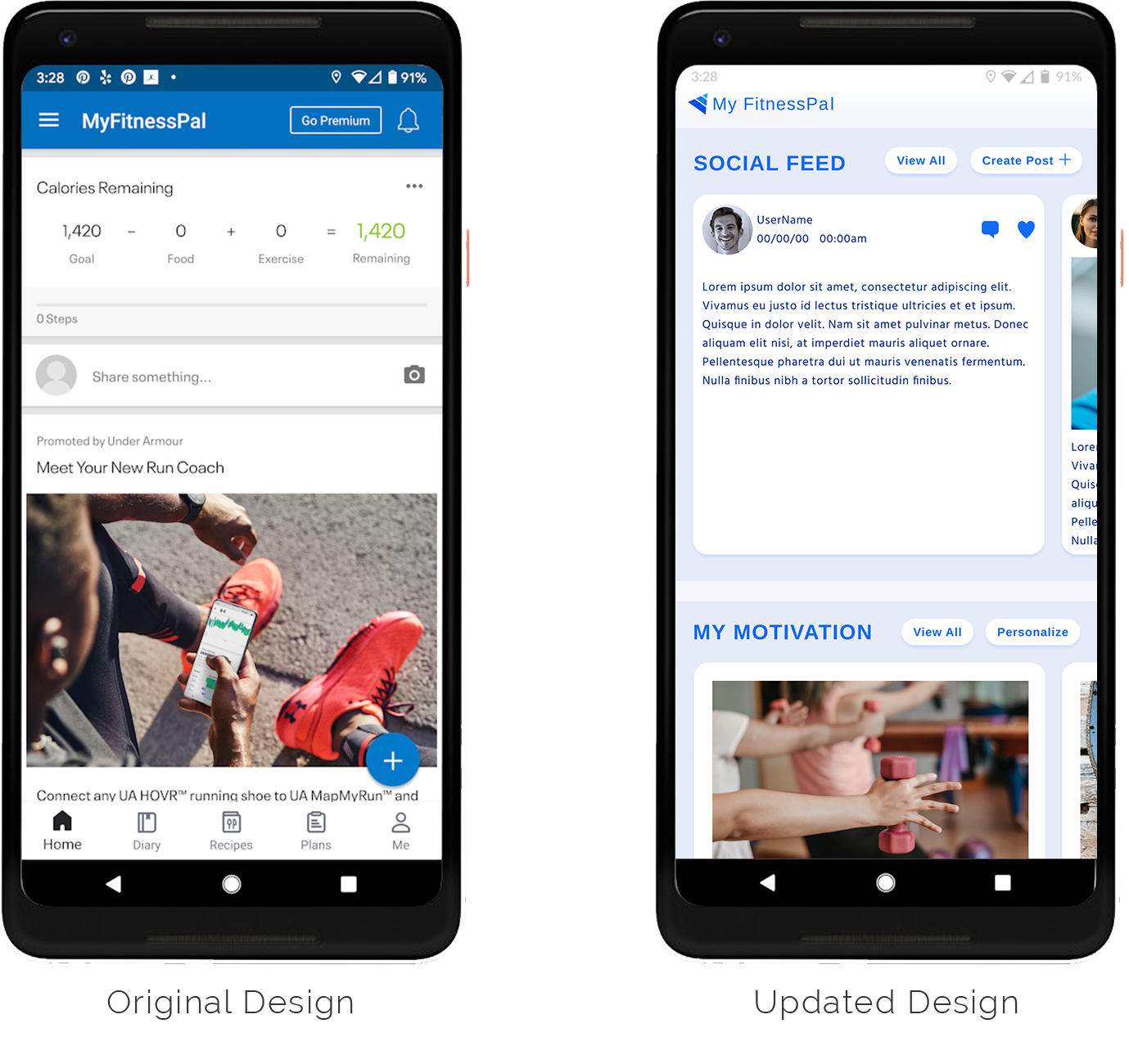
The existing design and structure of the My FitnessPal crams social sharing features and content marketing articles into screens that are not focused on these functions. This causes social elements to easily be overlooked or ignored. Content marketing feels more like display advertising vs. valuable tips and info.
Structural updates re-organize these features into a “Motivation” section that immediately gives users a tangible reason to interact with the features.
View the Figma prototype of the updated “Motivation” section to see the change in action.
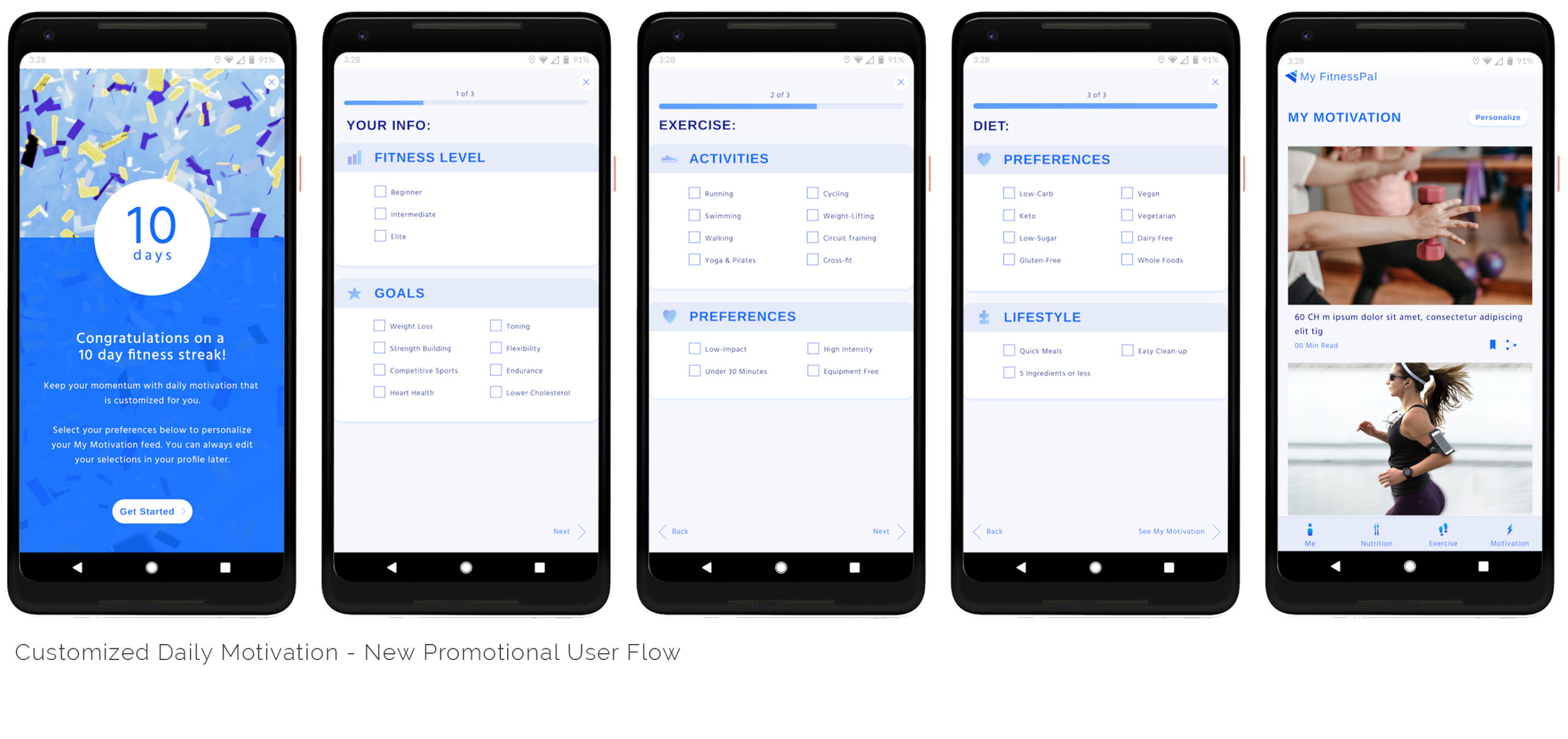
Promotional Personalization
In the existing version of the app, the third party blog content feels like it is tacked on and distracting from the primary user goals. In order to make this content more useful and relevant to the user, a new “My Motivation” section has been added.
Positioning this content as helpful tips and customizing it to a user’s preferences and lifestyle is likely to improve engagement and conversion while also increasing the user’s enjoyment of the app.

