Corvus insurance
User Research / Visual Design / Design Testing / Design System
goals
-
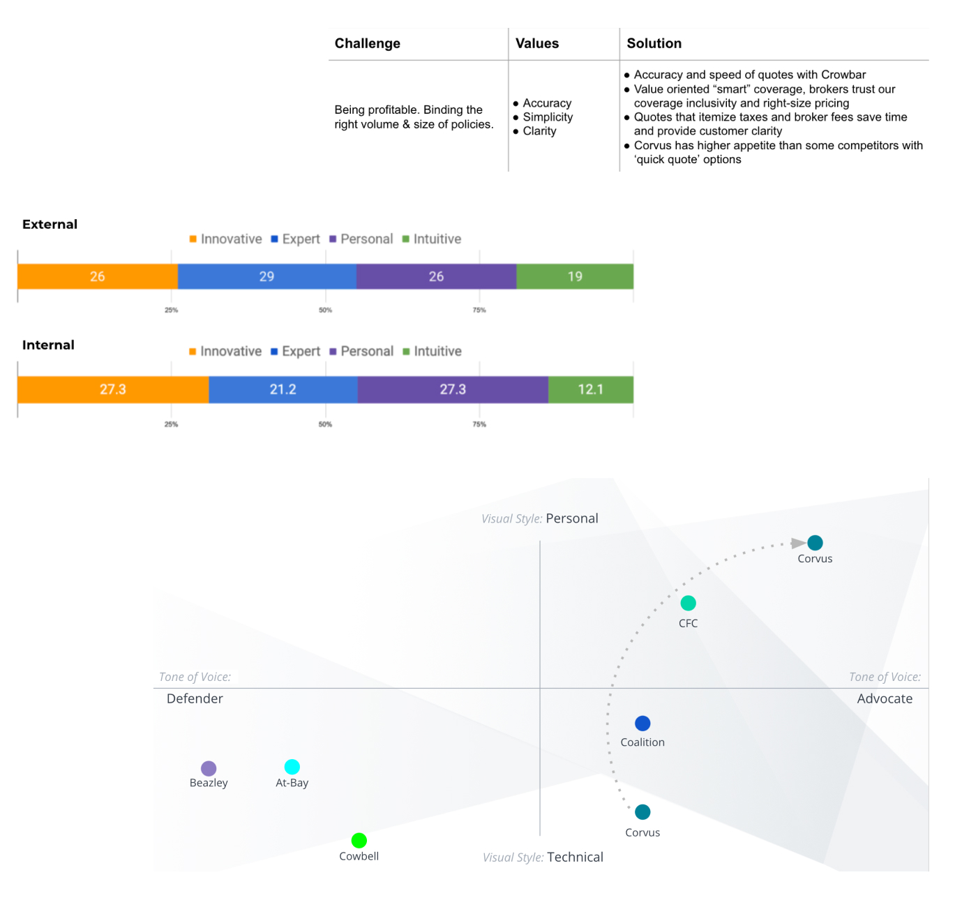
Uncover and quantify: user motivations, goals and experience; stakeholder contributions and vision; business goals and competitive landscape
-
Define what characteristics and benefits are integral and unique to the Corvus product and experience
-
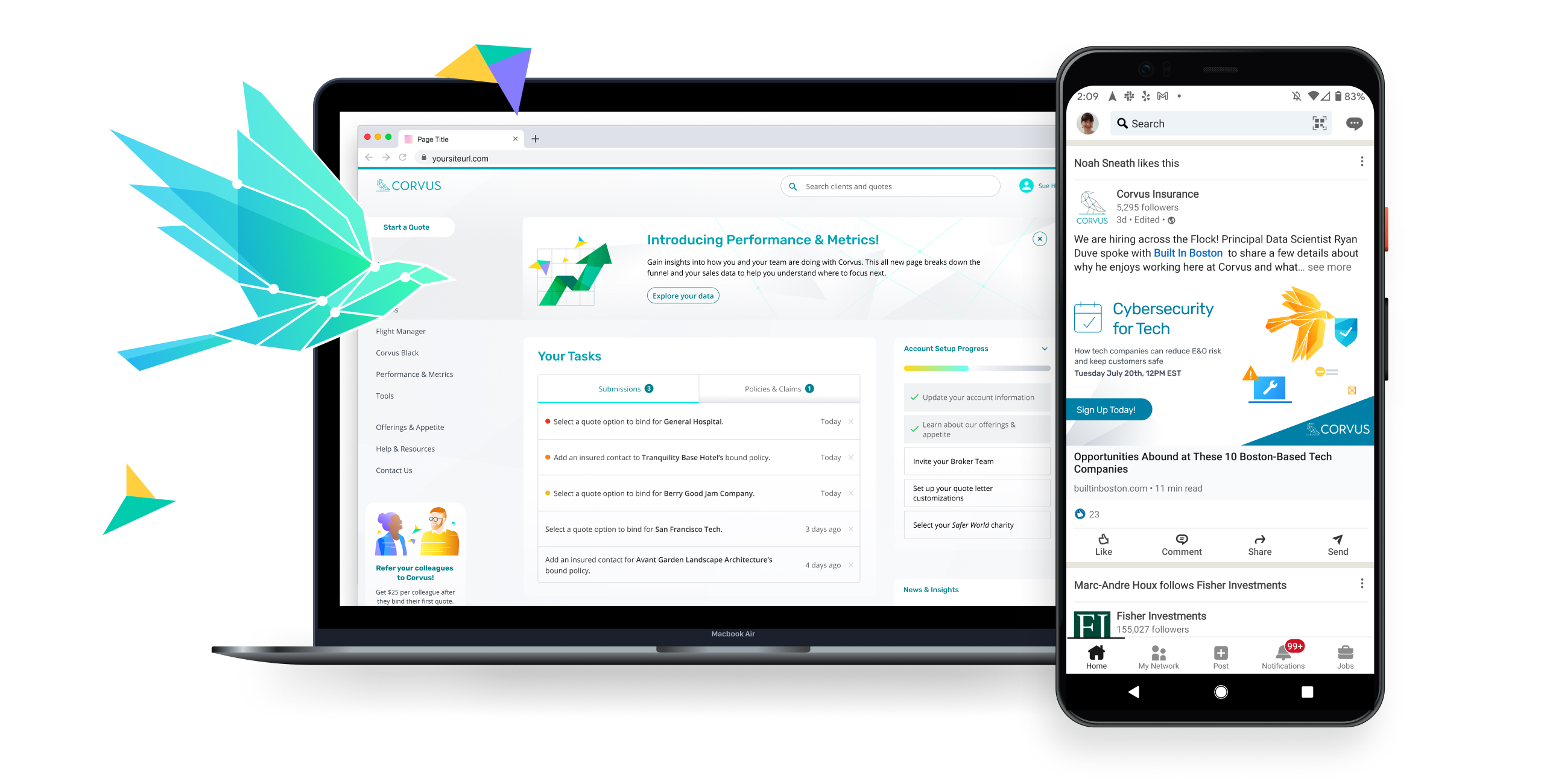
Develop a visual design system that conveys key benefits and traits, while enabling harmonized expansion of creative and brand within product and marketing touchpoints

Observe & Understand
Conducted directed interviews with cross-departmental, internal leaders and product users across all segments of the customer base including retail and wholesale insurance brokers to gain an understanding of the features, qualities and benefits that make the Corvus offering unique.
Conducted competitive research defining key players in the competitive landscape, mapping benefits and personalities to define a clear and ownable position for Corvus.
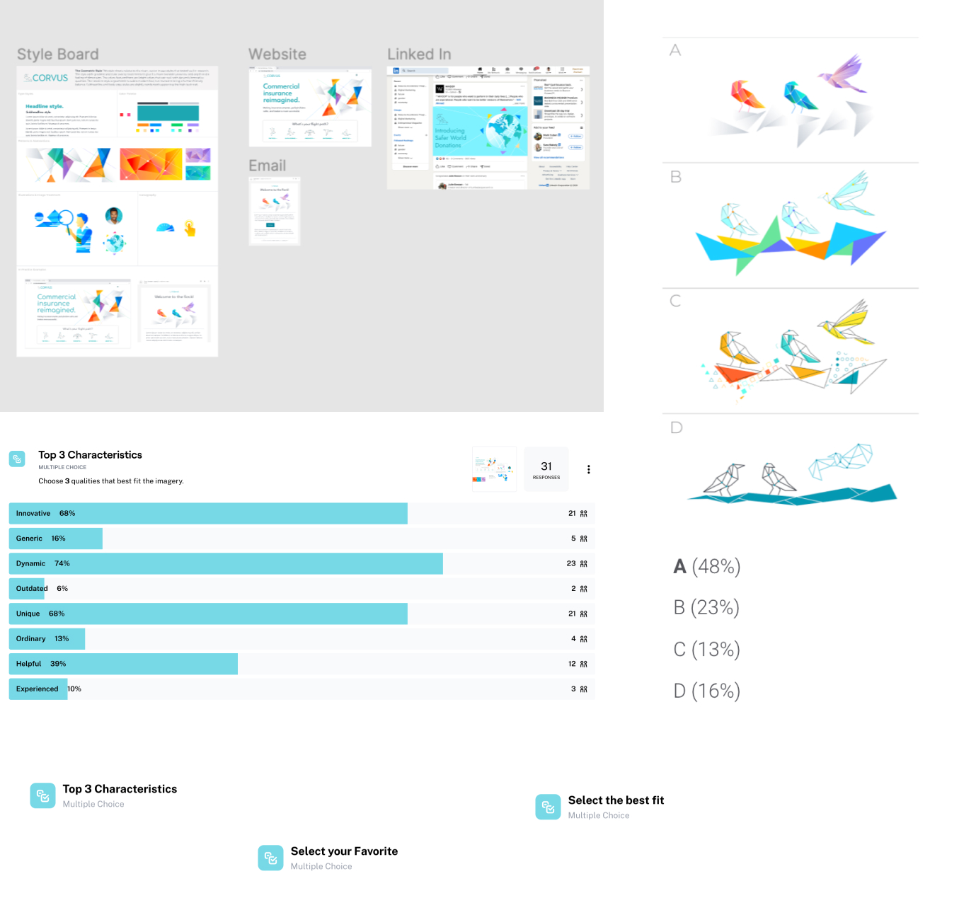
Compiled insight into qualitative/quantitative surveys to confirm and refine findings of defined characteristics and traits. Leveraging multiple choice, sorting and ranking questions to understand preferences and their weight, while incorporating open ended feedback opportunities for a deeper understanding of preferences and trends revealed by the data.

DESIGN / TEST / REFINE
Created additional surveys taken both by internal stakeholders and run as a generalized, unbiased opinion poll to define what visual styles related most closely with the unique value propositions of the product.
STANDARDIZE & IMPLEMENT
Updated and expanded upon a visual design system creating a full color system, with care to include accessibility research to ensure colors will meet AA standard compliance. Contributed to the development of a full set of clearly defined typographic styles. Developed an a component based visual design library with atomic and molecular illustrations that can be used individually or combined to create narrative illustrations that help to explain abstract concepts connected with both insurance and technology.

RESULTS
Within the first three months after implementing the updated visual design system we saw continued favorability in product experience expressed by a steady improvement in NPS scores moving from and already impressive 77 to an even higher ranking at 82. Within the first 6 months after implementing the new visual style in paid digital advertising in social platforms a dramatic improvement of conversion rates dropped the cost per lead by over 40%.
