
AttorneyDocs UI/UX & Visual Design
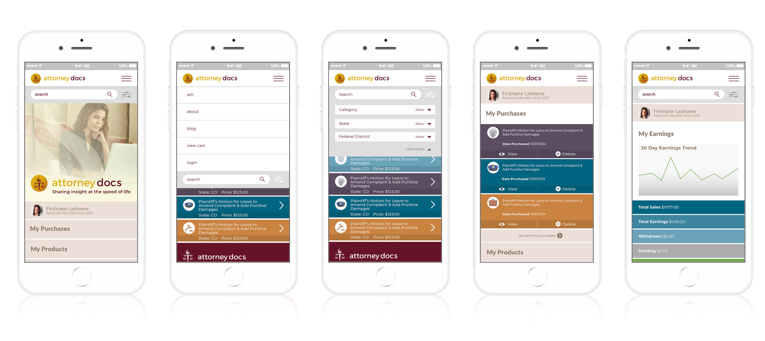
We started with creating a new look and feel for the brand that brought together collegiate colors with traditional watermark elements to give the brand a feeling of established trust. The color palette was expanded so it would be easy to highlight content that pertains to different topics within the large legal library.
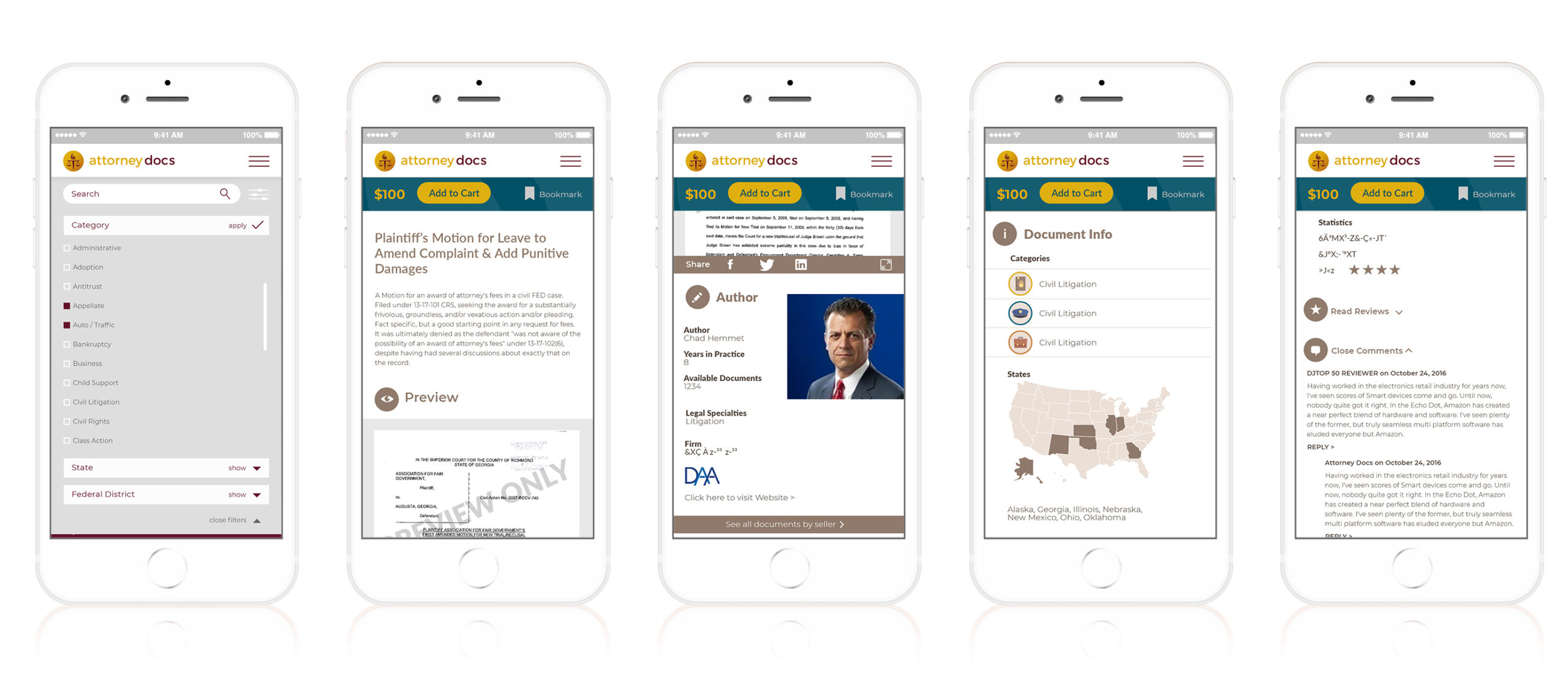
The user experience was improved with easy access to the “search” option, a primary destination for most users, as well as an updated filtering component that made it easier to drill down to exactly what documents fit the user’s needs. Improvements were also made to the “seller” portion of the website where lawyers can sign up to become contributors to the platform and earn income from template case files and documents they share. Changes here made it simpler to add the documents, sort through and revise existing documents, track earnings and see what content was capturing the most interest and purchases.
